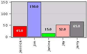
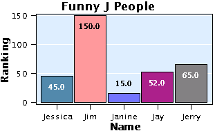
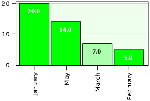
Figure 1. Simple barchart
First, create a data matrix containing names in its first column, and the corresponding values in its second column. Then, use the barchart function.
An example data matrix is:
A bar chart with this data is found by entering:
Figure 1. below shows the resulting chart.
Function barchart has several optional ways to personalize your chart. To add a title use the "title:text" option.
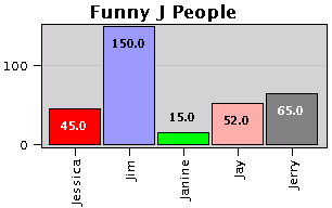
For a complete list of optional parameters, click the icon below.

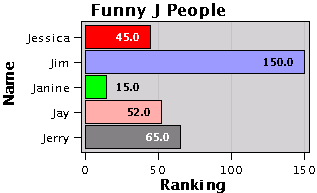
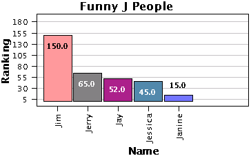
Labels can be easily added as shown in the line below. Also, the "horizontal" option is used to swap the axis of the chart.
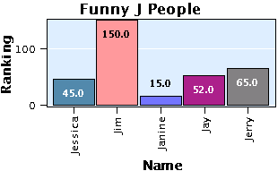
Custom colors can be specified in a third column of the data matrix. Notice you may use predefined names or_ you may specify the colors using hexadecimal values.
The color of the background and the color of the grid lines can also be specified. To remove the grid lines, use option "nogrid".
Example:
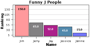
By default, the names are displayed aligned with the bars. Using the option "uselegend", names are displayed horizontally and a legend is used whenever the names do not fit in the chart.
Example:
If you need to sort the values, you may use the "sort" option. To specify the initial tick mark and their spacing use option "tickmarks:init_value:spacing", where both init_value and spacing are integers.
Example:
Other options.
Option "cumulative" draws a cumulative line indicating percents. However, this option will be ignored if there is a negative data value.
Option "absolute" plots negative values as positive.
All charts can be customized using the mouse.
Keeping the Z key down and then dragging the mouse, zooms the chart.
Keeping the P key down and then dragging the mouse, pans (translates) the chart.
Keeping the S key down and then dragging the mouse, selects a region for zooming.
Mouse support has been provided because you may capture the charts and further enhance them using third party software. Figure 7. below shows the graph above customized using the mouse.
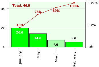
Pareto charts are a special type of bar charts in which all values are sorted, negative values are displayed as positive, and only two colors are used; one for positive values and the other for negative values.
Let's create a new data matrix:
A Pareto chart with this data is found as follows:
Figure 8. below displays the resulting chart and the default colors.
To change the default color for positive values, use a color name as an option. Use option "negative:color" to specify the color for negative values. The example below uses green for positive values, a light green for negative value, and even a lighter green for the background.
For a complete list of optional parameters, click the icon below.
If you need to show cumulative values, use the "cumulative" option as follows:
All of the optional parameters presented for bar charts, apply for Pareto charts too, e.g. "uselegend", "nogrid", "grid:color", etc.
Pareto charts can also be customized using the mouse. See available keys above.
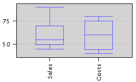
To prepare a box-and-whiskers chart, create a matrix with 3 to 6 columns of data. The first column must contain names.
The content of the other columns is summarized below:
Example:
A box-and-whiskers chart is obtained using function boxwhiskers as shown below.
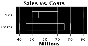
Box-and-whiskers charts have the same options as bar charts and pareto charts. For example, you may customize the chart above as follows:
For a complete list of optional parameters, click the icon below.
Box-and-whiskers charts can also be customized using the mouse. See available keys above.
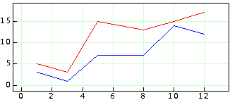
To plot x-y pairs of values, create a data matrix with its first column containing the x values, and the second column containing the y values. Then, use function xychart.
Example:
First we create some data.
To plot the first set do:
To add the second set in red, do:
Figure 13 below shows the resulting chart.
For a complete list of optional parameters, click the icon below.
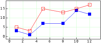
In addition to specifying a color, several decorations are available. You may use options "circle", "rhombus", "square", "triangle", "vertical" and "noline". Except "noline", all of them accept an optional size, a color and the option "nofill".
For example, to draw the first set with blue squares (default color) of size 10 pixels, do:
To draw the second set of values with red squares of size 10 pixels and no fill, do:
The resulting chart is shown below.
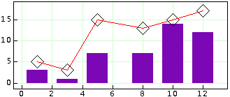
The final example shows the use of the "rhombus", "noline" and "vertical" options. Option "vertical" draws a vertical bar connecting the data point and the x axis.
XY-charts can also be customized using the mouse. See available keys above.
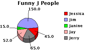
First create a data matrix containing names in its first column, and values in its second column.
For example (reusing data from previous section):
Finally, use the pie function:
Figure 16 below shows the resulting chart.
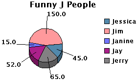
A title can be added using the "title:text" option as shown below.
For a complete list of optional parameters, click the icon below.
Custom colors can be specified in an optional third column.
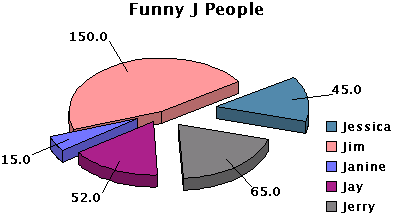
Pie charts can be extensively customized using the mouse. The following functionality has been implemented:
The chart below is the same one as the one above but further customized using the mouse. All keys listed above (except S) were used.
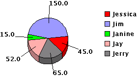
By default, the program writes the names (first column of data matrix) in the legend, and the values (second column) in the pie.
To control that format, use the "format:legend_format:pie_format" option. Option "format" has this syntax:
"format:legend_format:pie_format" where legend_format and pie_format are strings formed with numbers and/or letters and, one or more of these special combinations: #N, #V, #%.
For example,
"format:#V (#%%):#N"The combination #N stands for the name, #V stands for the value, and #% stands for the percent. If you want the percent sign (%) to appear, you need to add it in the format string.
Using the format above, we obtain the following chart,
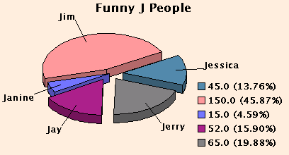
Notice that option "background:color" was also used.
If you do not specify a format, the option "format:#N:#V" is used by default.
If you want to remove the legend, use the option "nolegend".