Function pareto() accepts several options to customize your plots.
To try the examples below you may use this matrix:
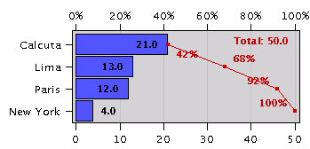
a=("Lima", 13 @ "Paris", 12 @ "New York", 4 @ "Calcuta", 21 )
NOTE: Words in italics are to be replaced by numbers or keywords.
"axes:color"
Uses the specified color to draw the frame and tickmarks surrounding the plot.
pareto(a, "axes:red")
"background:color"
Draws the background using the specified color.
pareto(a, "background:white")
"canvas:color"
Fills the background canvas using the specified color.
pareto(a, "canvas:#dddddd")
"cumulative"
"cumulative:color"
Draws a line showing cumulative values. Uses the specified color.
pareto(a, "cumulative")
"grid:color"
Draws a grid using the specified color.
pareto(a, "grid:green")
"horizontal"
Draws the chart with values in the horizontal line.
pareto(a, "horizontal")
"labels:xtext:ytext"
Draws labels along the axes using the supplied texts.
pareto(a, "labels:City:Qt(T)")
"name:text"
Changes the name of this plot.
pareto(a, "name:Project1")
"negative:color"
Draws bars for negative values using the specified color.
pareto(a, "negative:white")
"noaxes"
Removes the frame and tickmarks surrounding the plot.
pareto(a, "noaxes")
"nogrid"
Draws the background without a grid.
pareto(a, "nogrid")
"tickmarks:first:spacing"
Draws the tickmarks starting at first with the given spacing.
pareto(a, "tickmarks:5:10")
"title:text"
Draws a title using the specified text. Two lines may be specified by using a \n to mark the end of the first line. See example below.
pareto(a, "title:Cities\n8/8/02" )
"uselegend"
Tells the Calcugator to use a legend when the descriptive names are too big to fit nicely written on the axes.
pareto(a, "uselegend")